Responsive Web Design
Mobile-First, Multi-Device Compatibility
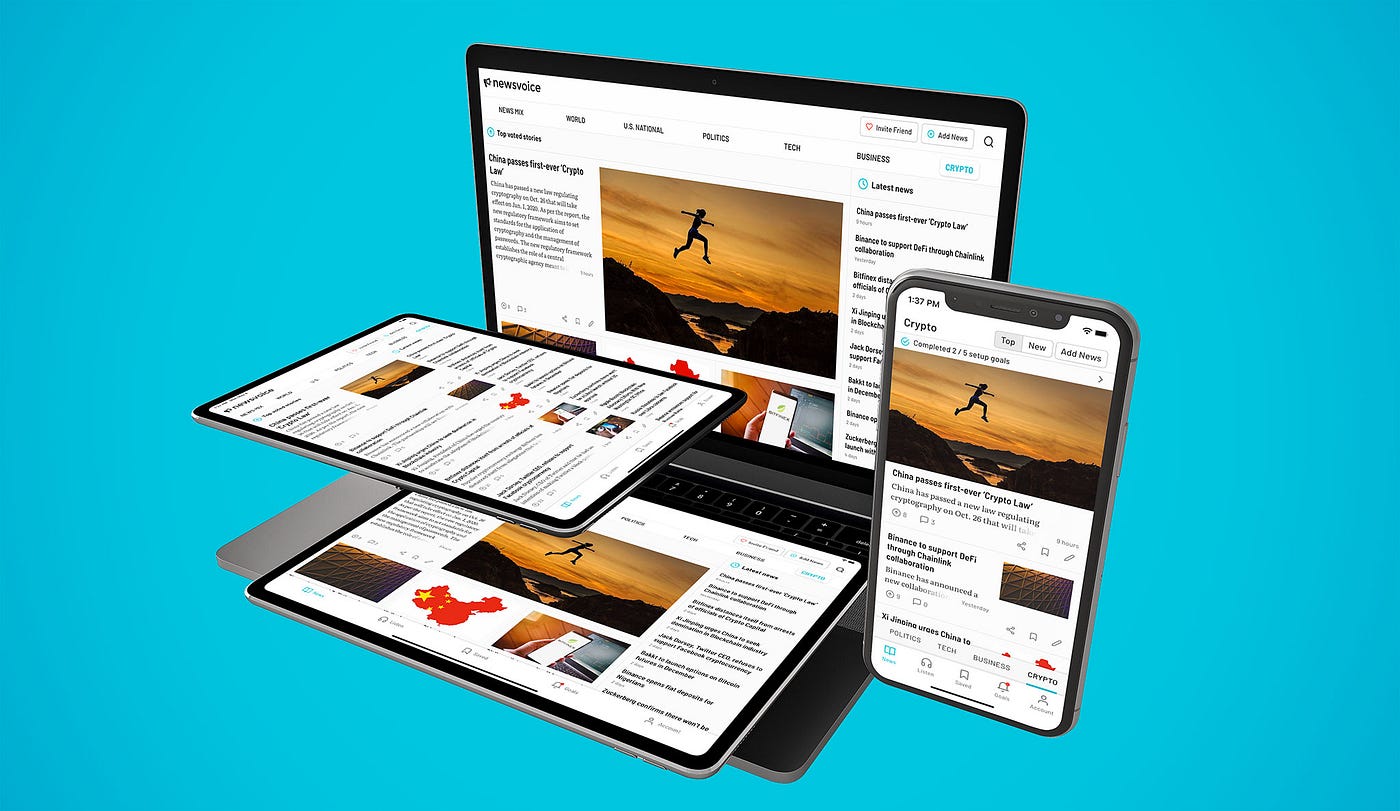
In today’s digital landscape, users browse, shop, and interact from a variety of devices—smartphones, tablets, laptops, and desktops. That’s why at Vistara Print, we follow a mobile-first, multi-device design approach, ensuring that your website delivers a seamless experience no matter how it’s accessed. Our responsive web design strategy begins with mobile optimization at the core—because more than half of all web traffic now comes from mobile users. We craft layouts that adapt fluidly to different screen sizes, maintaining clarity, functionality, and aesthetics across all devices. From intuitive navigation and touch-friendly elements to fast loading speeds and clean con...
Optimized User Experience (UX)
At Vistara Print, we believe that great design goes beyond aesthetics—it’s about creating a smooth, intuitive, and enjoyable journey for your users. Our responsive web designs are built with a strong focus on Optimized User Experience (UX), ensuring your website not only looks great but also functions effortlessly across all devices. We design with your audience in mind—prioritizing fast load times, clear navigation, logical content flow, and interactive elements that guide users naturally from one step to the next. Whether a visitor is exploring your homepage, browsing services, or completing a purchase, each interaction is carefully crafted to reduce friction and maximi...

SEO & Performance Boost
At Vistara Print, our responsive web designs are not just visually appealing—they're strategically engineered for SEO and performance optimization, helping your website rank higher and load faster across all devices. A fast, mobile-responsive website is a major ranking factor in Google’s algorithm, and we make sure your site meets all the standards that search engines—and users—love. We build with clean, semantic code and optimized structures to ensure faster load times, efficient indexing, and superior performance scores. From compressing images and minimizing scripts to leveraging browser caching and mobile-friendly design, every element is crafted to enhance your site'...

Consistent Branding Across Devices
At Vistara Print, we know your brand’s identity is more than just a logo—it’s the visual and emotional thread that connects you with your audience. That’s why we design responsive websites that deliver a consistent branding experience across all devices, ensuring your message, visuals, and user interactions remain cohesive from desktop to mobile and everything in between. Whether your users are viewing your site on a smartphone, tablet, or laptop, we maintain alignment in colors, typography, imagery, spacing, and tone—so your brand always feels familiar and trustworthy. Our mobile-first design philosophy ensures that branding elements scale and adapt gracefully, without d...

Future-Proof & Scalable Design
In a digital world that evolves rapidly, your website needs more than just a great look—it needs to be built for the future. At Vistara Print, we craft future-proof and scalable responsive web designs that not only meet today’s technology standards but are also ready to grow with your business. Our design approach is rooted in flexibility and forward compatibility. Whether you plan to add new features, expand your content, integrate third-party tools, or support a growing user base, your website’s structure and design will easily adapt—without needing a full rebuild. We use clean, modular code and scalable frameworks that make ongoing updates and maintenance efficient and...
